Settings—A Success Story
Too many notifications? Customize them in Settings.
Are you feeling lost? Find helpful resources in Settings.
Subscription halted? Track payment history in Settings.
The time has come to give settings some TLC!
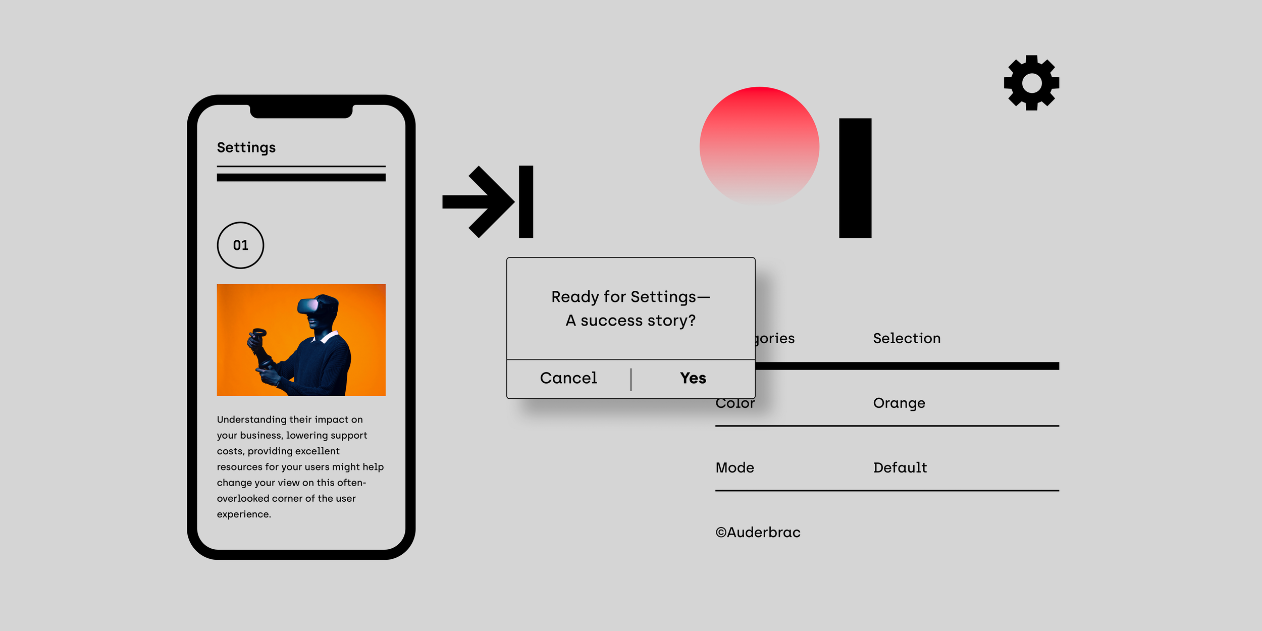
Settings are often packed with options but usually aren't a focus at the start of product design. The issue: As we add more information, navigating becomes harder. Recognizing how settings affect your business, reduce support costs when done well, and enhance user resources can shift your perspective on this overlooked aspect of user experience. By giving as much thought to settings as you do to other parts of your product, you and your users will gain advantages.
If you think good design is expensive, you should look at the cost of bad design.
Ralf Speth, CEO, Jaguar
At first glance
Make it scannable
With a long list of settings, it can be difficult for users to find what they need. Make this manageable by grouping settings into easily scannable categories. How many you need depends on the complexity of your product, and if you get above 10–12, you may want to consider making sections of categories. It’s crucial to use plain language that implies the functionality and avoid technical or clever names that further confuse users. Common sense and the use of a small test group will go a long way.
Prioritize
Once you have your categories down, ensure the most important ones occupy the top positions. In other words, placement should reflect the order of importance and or frequency of use. Deprioritize settings that are rarely used or those that strictly hold informational, non-actionable content — for example, the ‘About’ section likely contains only perfunctory information such as the app version number and copyright text.
Destructive items last
The objective of your business is to keep users engaged. Having a negative item like ‘Sign out’ or ‘Delete,’ etc., at the top of your settings is not exactly welcoming. And how often do you think users will log out or delete their data? A better placement for these settings is at the bottom of the page to reduce their prominence.
Make it searchable
Most products won’t need to include a search, but growing your product over time might leave you with an extremely lengthy list of settings. We are too familiar with hunting for that one setting on our phones, buried in a list of obscure options. Providing a way to search for a setting can save users valuable time. There are no fixed rules, but monitoring user feedback and time spent in settings can give you a sense of when to consider this. Another way is to list some basic settings and see how a test group scans and navigates to find them. If you include a search, it should live at the top.
Highlight
Working through your settings to provide excellent accessibility for users is step one. But leaving it at that would be a missed opportunity for timely content. Done right, using the top as a flexible area to highlight ongoing promotions or new product offerings can generate excellent results. Plan to bake this into your teams’ content schedule; there is nothing worse than seeing outdated content. Other things you might want to draw attention to include your updated terms, late payments, the amount of cloud storage left, etc.

Examples of using the top as a flexible area to highlight timely content.
Going Deeper
Brief introductions
When a setting isn’t self-explanatory, taking the time to introduce and clear up any questions about the intent of a specific setting is well worth the effort. Just because it makes sense to you doesn’t mean it makes sense to the user looking at this for the first time. One clarifying sentence is all it takes. Mind you, an introduction is different from any help copy, and littering the UI explaining every detail is not the way to go about it. That’s when the little ‘?’ or ‘i’ comes in handy to keep a clean interface and information tucked away and ready when needed.
Opt for a single view, not tabs
When you have many settings that affect the same function, you might feel tempted to separate them between different tabs. Keeping related options in one view is fundamental for better decision-making. Ask yourself: Is there an even better solution than adding more options to the list? Can you cut some options? And never underestimate concise copy. It’s your best weapon!
Clear and consistent labeling
Everywhere you’ll find examples of labels that do the opposite of what they were intended to do—to guide in its most concise form. It’s important to be intentional with your labeling, and users should not have to spend time wondering whether different words or actions mean the same thing within the context of your product. The same logic applies to icons: Don’t use them merely as decoration to fix the lack of visual interest. Per design, icons should be interchangeable with the word/phrase/concept they illustrate and should communicate to a global audience (if applicable) in a way that’s inclusive of different cultures.
You do the work—not your users
Sometimes we forget that design means solving problems for others, whether that takes form visually or structurally. As much as possible, you should do the upfront work and provide options that users don’t have to study to understand. They should communicate instantly. In the context of settings, here are a few pointers.
01—Be iconic
What purpose would it serve to start each item in a list of options with the exact same phrase? Start with the most identifying words to distinguish each option from each other instead of making them look identical, e.g., ‘Alert me when…’ If it makes sense to use the same label, place it as a small header right above your options.

02—One choice per option
Baking multiple choices into one option might save you a bit of space and occasionally be inevitable. Still, it means you’re asking users to track all options in a list and compare them. The more straightforward way is to single out your choices to one per option.

03—Consistent types
When giving the user options to choose from, try putting yourself in their shoes. There is no reason to make it any harder than placing your coffee order. Check, check… and done! Every situation is different, but the lesson here is not to mix and match options of various types: ‘I want…’ and ‘I don’t want…’ That causes unnecessary confusion.

04—Appropriate form
Make sure you choose the option that fits your content the best, whether it’s using checkboxes for ‘multi-select’ or radio buttons for the ‘pick-one’ option. Drop-down lists are usually avoided in the settings area so that users can easily compare the options vs. hiding them.
Checkboxes
Used when there are lists of choices. Checking one box doesn’t uncheck the others, as each checkbox is independent of all other checkboxes in the list. Users can select any number of options, including none, one, or several. Keep all checkboxes square.
Radio buttons
Used when the user selects only one choice in a list of two or more mutually exclusive options. Picking a non-selected radio button will deselect any previously selected option. Radio buttons should be round.
Toggle-Switch
Used for turning on or off a single option. In this instance, a single stand-alone checkbox that you check or uncheck works as well.

05—Keep it friendly and to the point
When writing product copy, remember to keep it light and friendly. In other words, go for glass half full rather than glass half empty in your communication as often as possible. For destructive actions, use a secondary confirmation to highlight the severity and finality of the action rather than heavy-handed language. Start with what’s important and avoid ineffective introductions in your confirmation boxes, like ‘Do you want to…,’ ‘This action will…’ and, ‘Are you sure?’

06—Choose your words
Labels and dialog boxes are brief, so make them explicit by choosing your words carefully. Specifically, when buttons are grouped together as siblings, users can easily get them mixed up using too similar terms. Sometimes, an additional defining word is all it takes to separate them. For example, if both labels have negative connotations, users will read them both as destructive actions. Using a label that’s the opposite will help users tell them apart. Less similarity equals more clarity.
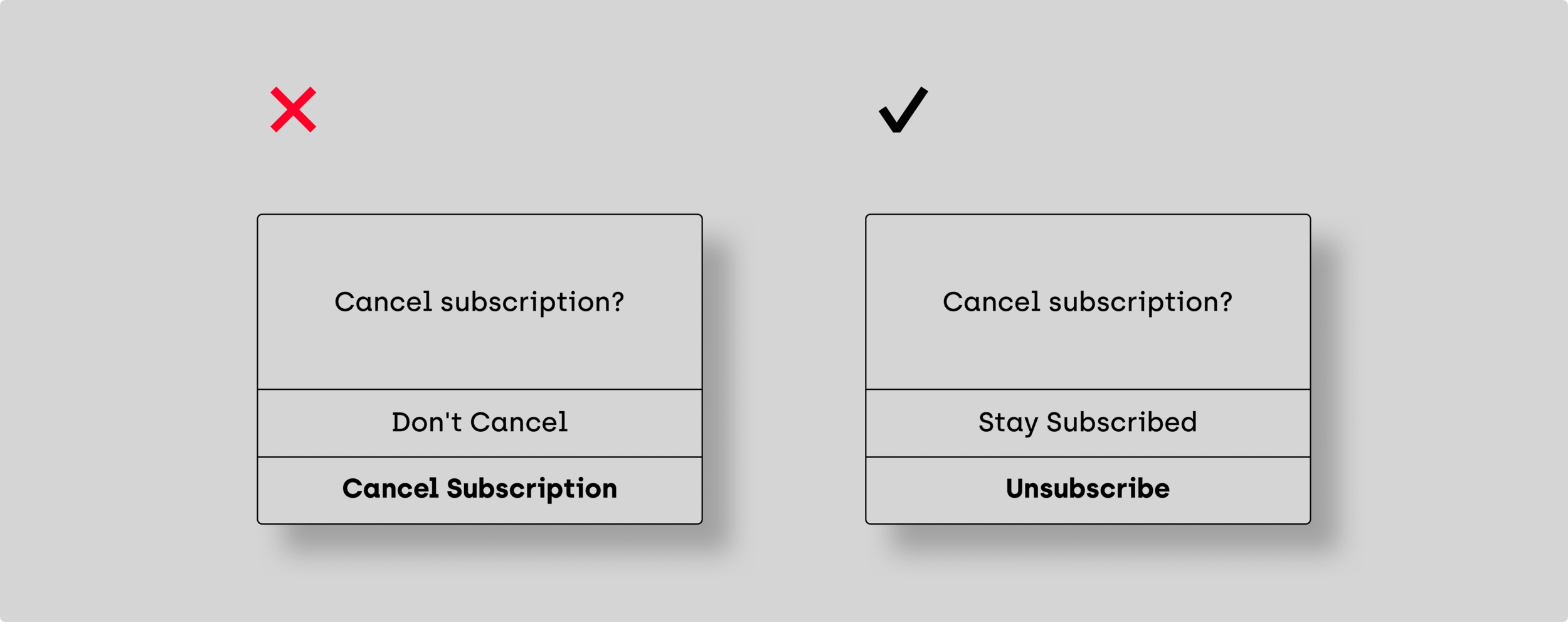
07—Action and consequence
Labels must communicate the action performed when you press the button and ensure users know the consequences of the action they are about to take. It can be wise to reuse the word that drives the action. For instance, if you ask users to save their payment details, use ‘Save’ instead of a simple ‘Yes.’

Keep in mind
Status and feedback
It’s not uncommon that settings save automatically, but users still need feedback that confirms their changes. If users click a ‘Save’ button, make sure it’s prominent. Making users scroll is bound to result in unsaved changes.
Email confirmations
Many products contain sensitive data, including financial information. Email confirmations exist outside settings, but they’re critical to alert users when their account details change. Depending on the settings involved, sending confirmations for every update may not be necessary, but for those where it makes sense, it builds trust with the user.
Settings overload
Providing control interacting with your product indicates you care about the user, but complete control is not always better. Focus on features that show you understand the users’ basic needs. Keep the ‘just for fun’ settings, such as changing your profile background texture, to a minimum. If your product has an extensive range of settings, consider offering users a simple way to return to the default settings as a nice gesture.
◼︎
Finding my voice on Medium—a space for lively ideas
Design Thinking, Product Design
In 2022, I dove into UX writing. I had been doing it for years in my work and projects, but never in article form. For months, I hesitated, convincing myself I had no stories worth sharing and wasn’t experienced enough on Medium. I kept waiting to feel ready.
The truth? I was never going to feel ready. It only happened because I made it happen.