Creative and Product Lead for beloved indie gaming platform
UX/UI, IxD, Identity / Branding, Animation
Kongregate offers a wide variety of free-to-play games, playable directly in the browser. Players earn achievements, collect Kongpanions and connect through chat. It’s also a launchpad for indie developers with tools to upload and monetize games.
16 years in gaming
130K games
20M monthly active users
200 Countries accessed
30K developers earning $10M annually
I led the brand effort to revamp the platform, aligning it with a new vision and implementing a Design System for a unified, engaging user experience
A rebrand committed to inclusivity
The platform was at a turning point, and to move it forward, I first needed to understand its foundation. Weeks of conversations with stakeholders across the company painted a picture of its history and potential. From there, I led the push to make inclusivity a core focus, expanding accessibility, broadening representation, and ensuring it remained a welcoming space for everyone. It all started with the logo and rebrand, setting the stage for everything that followed.
Kongregate’s old logo featured the iconic ant, but it often appeared without it when used on its own. The brand had plenty of assets, but they weren’t designed to work together. What Kongregate really needed wasn’t just a set of tools to work with, but a toolbox that worked for them.
A pivotal moment came when a decision from the top was made to remove the iconic ant character. While the ant symbolized hard work, community, and resilience, there was a need for a more streamlined identity. Instead of removing it entirely, its essence was incorporated into the “K” with antennae. More about the rebrand on Medium.
The new logo treatment embodies Kongregate’s spirit of bringing people together, fostering a global community of creators and players. It represents inclusivity, curiosity, and collaboration, reflecting our passion for games, respect for diversity, and empowerment.
A modern foundation for a legacy platform
After 15 years of patchwork updates, the platform had become cluttered, inconsistent, and on top of it, not responsive. This wasn’t just a redesign but a complete overhaul, transforming the visual design and functionality to create a flexible foundation that could adapt to users’ evolving needs.
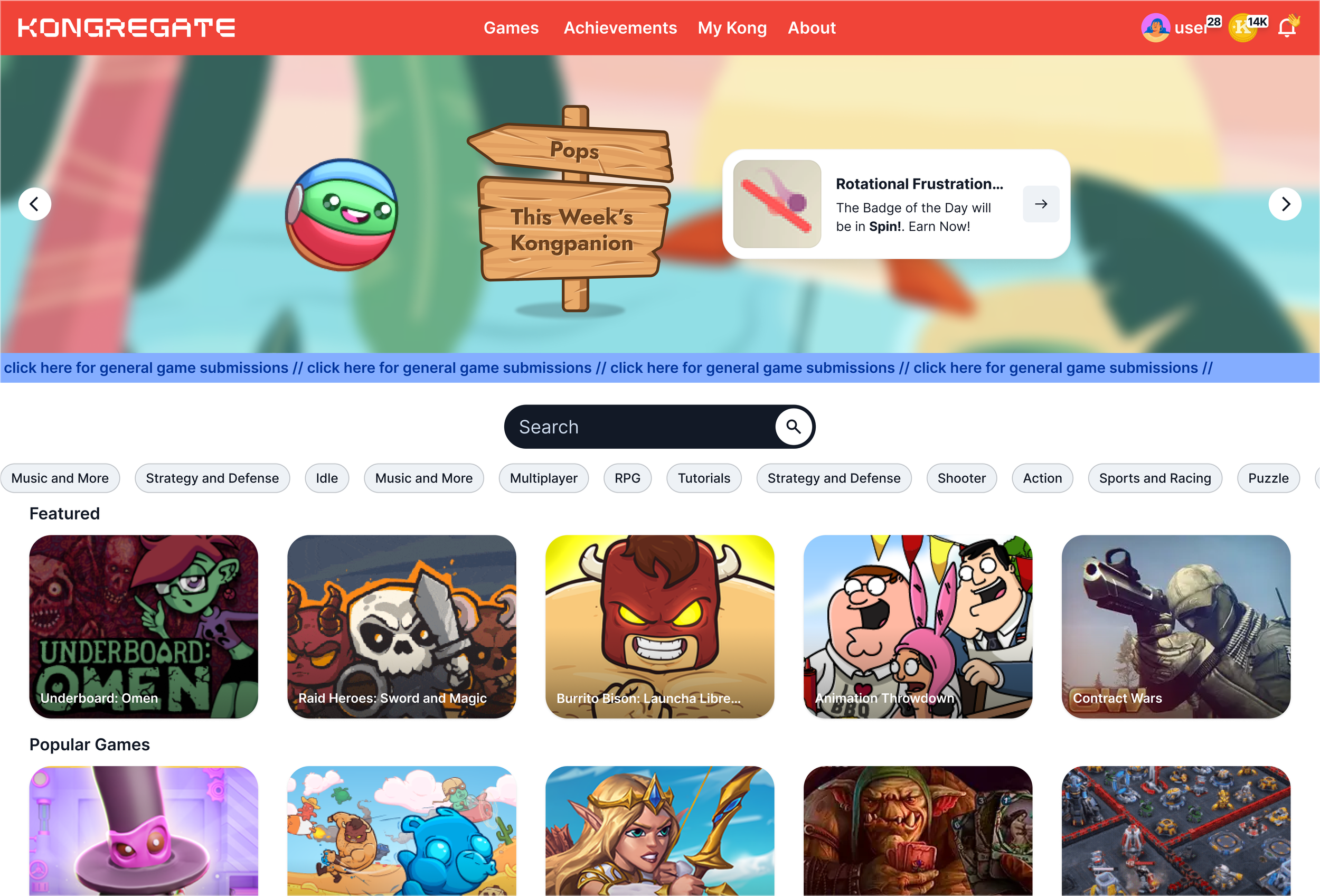
The old homepage felt outdated and in need of a refresh.
Before fully launching all features planned for the homepage, we released a simplified version as the first update.
Building a flexible Design System
As the brand grew, so did the chaos—different teams, different rules, endless fixes. We needed one system to keep everything consistent and scalable.
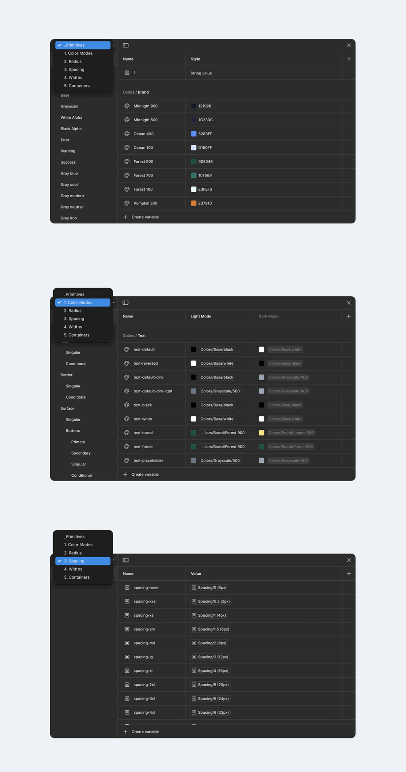
The power of Variables
I created a design token system to ensure consistent themes, simplify updates, and integrate accessibility from the start. This approach eliminated mismatched buttons and last-minute fixes, providing a reliable system that works across the board.
The Game Card unified
The game card, the cornerstone of the platform, had significant usability issues
When users interacted with the game card, a popover appeared with crucial information, often covering other content. This frustrated users, especially on mobile, where the hover state didn’t work, creating a poor experience.
Simplified and Accessible
The card was redesigned to display all essential information upfront, removing the need for a popover. With details like the developer, tags, ratings, and visuals integrated seamlessly, it no longer disrupts other content. The fully responsive design offers mobile users the same active card state and game details as desktop users, ensuring a smooth, consistent experience across devices. User testing has shown positive feedback for its simplicity, ease of use, and quicker decision-making.
Engaging Visuals and Interactivity
An auto-rotating carousel was added to highlight key game moments. This feature keeps the covers clean while still teasing in-game moments for games that have additional assets, making the experience more interactive and visually dynamic.
Smart design across grids
The game card adapts to different layouts: compact in list view, with essential info, and more detailed in a larger grid with a stronger visual hierarchy. It includes condition-based animations, optional CTAs, and labels to highlight key features or promotions, ensuring seamless integration across various designs.
Versions of the game card, from cover to listing.
Navigating the new site
The primary navigation was a mess—a multi-row nav taking up too much space and feeling cluttered. Inconsistent font sizes threw off the flow, key features were buried in separate menus, and categories overlapped, focusing on the wrong things. The side nav for filtering games was unclear, adding to the confusion. And that’s just the tip of the iceberg.
Good navigation isn’t just about getting around—it shapes the whole experience.
The primary navigation used a full-width dropdown, consuming valuable screen space and failing to effectively highlight new features.
New single row navigation
A single row navigation was implemented to improve usability across all breakpoints, with primary nav items focused on driving activities for intuitive navigation. Profile and notifications feature expandable menus, and Kreds is front and center, with space for future crypto wallet integration. Updated font sizing and a cohesive design improve readability and consistency, while the responsive layout adjusts smoothly across devices. The themed navigation keeps users oriented across different areas of the site.
Dynamic ‘mini’ Game Playlist
Players could curate lists, but user research and hunting in the admin backend revealed they often became outdated over time. A dynamic game playlist was introduced to automatically track frequently played games, creating a personalized list that evolves with gameplay. They can also manually curate their list for full control.
Collapsable Sidebar
Sidebars are a crucial element across many templates on the platform, but their lack of consistency created confusion and inefficiencies. To address this, I redesigned the side navigation with simplicity and efficiency in mind.
By using an icon-driven approach, users can quickly access key sections without cluttering the interface. The option to collapse the side navigation ensures the main content column remains the focus, reducing visual clutter and providing more space for content.
The updated sidebar navigation now uses the same component across all templates.
Dynamic Search
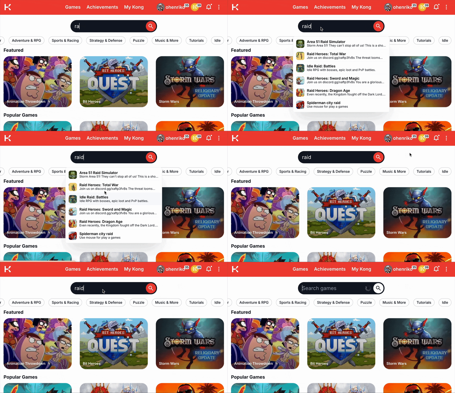
Search was stuck in the primary navigation, limiting its flexibility. We knew we could do better. By moving it to the page itself, we gained the freedom to adjust its size and position depending on the template. In some cases, as you scroll, it lifts off the page and snaps to the edge in a minimized state. Real-time suggestions appear as you type, making it easier to find what you need. This approach allows the search feature to seamlessly adapt to any context, getting the right attention where it’s needed.
Search results are visually distinct to help users navigate mixed categories, such as games and the ‘adventure’ tag, which indicates 246 games under that category.
The search bar now updates results in real time as users type.
Display and share your Achievements
It’s not just stats—it’s a visual story of a player’s gaming journey. The focus was on making the profile more personal and engaging. Key achievements, milestones, and high scores are now prominently displayed. This not only provides an opportunity to celebrate victories but also encourages sharing progress with the community.
We introduced a focus views to give players the ability to see all the details they’ve without distraction. It’s also the perfect place to share those achievements.
Unlocking and sharing Kongpanions
Each Kongpanion is a limited-edition collectible available for a one-week window, unlocked in two steps. First, players unlock the Kongpanion with clearing a badge in the game for that day, then collect four additional badges to unlock its shiny state. The exclusivity of the Kongpanion creates organic buzz, driving new player acquisition and encouraging current users to act quickly before the window closes.
Can you spot the little monkey’s hand peaking in?
Once a Kongpanion is unlocked, it’s displayed as a flippable card showcasing its traits, rarity, and collection number. These cards are shareable across major social platforms with customizable backgrounds and frames, encouraging players to spread the word.
A Tailored experience for every user
For years, the game detail page had a fixed layout with a game area and a sidebar for updates, instructions, and badges. The developer set the game’s size, but the lack of responsiveness often cut off parts of the game or sidebar. The play view was in an overlaying window instead of full screen, which should have been the default. Worse, unintended scrolling could shift the entire play view out of the browser window, further disrupting the experience.
The previous play view was unresponsive, and your service were offered no customization.
In the old design, the sidebar relied on tabs to switch between views, sometimes highlighting active content outside the visible area.
Introducing the “bento box” design
The new approach introduced a more flexible “bento box” design, allowing users to choose between playing in a fixed ratio set by the developer, which preserved the game’s aspect ratio, or letting it scale dynamically to fill the available window. This design ensured that the game would never require scrolling, providing a smoother, more user-friendly experience. Most users preferred the dynamic scaling option.
Sidebar access to more features
The sidebar also evolved to hold even more activity, now controlled by a menu fixed to the bottom for easier access. Users could still adjust its size relative to the game area, and it expanded to include chat, community discussions, leaderboards, and a clearer breakdown of badge requirements, particularly for those involving multiple tasks.
In the redesigned ‘play view’, you can adjust the size between the game window and the sidebar by dragging the divider to your preferred width.
A set of sidebar panels with icon-driven, minimized states for a cleaner, more streamlined interface.
Additional Screens
Explore the essential screens that define the user journey. Each screen is designed for seamless navigation and easy access to key information, ensuring a consistent and engaging experience across the platform.
Achievements—Quests.
User Profile and “Todo” Cards.
Admin Panel—User transactions.
Support Center.
Account creation, pick your username.


